- Benjamin Haresign
- 06 Aug, 2026
- Access
- 12 min read
A benchmark is a signal—not a diagnosis
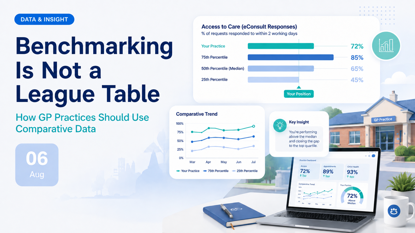
Benchmarking Is Not a League Table: How GP Practices Should Use Comparative Data
Comparative data can help a GP practice identify unusual patterns, ask better questions and decide where further investigation is needed. But a percentile is not a verdict, an average is not automatically a target, and being different does not necessarily mean being worse.
Why benchmarking is not a league table
General practice now has access to more comparative information than ever before. Practices can examine appointment activity, workforce capacity, telephone demand, online-consultation use, patient experience, prescribing, prevalence, funding and population characteristics.
This creates opportunities for better decision-making. It also creates a risk that complex operational data will be reduced to a ranking.
A league table assumes that every organisation is taking part in the same competition, under the same conditions, with the same objective. GP practices are not.
Practices serve different populations, operate from different premises, use different access models and have different workforce structures. Some are highly urban; others are rural or dispersed. Some have large care-home populations, high levels of deprivation or significant population turnover. Some operate total-triage models, while others maintain a greater proportion of telephone or reception-led access.
A benchmark tells you where a value sits.
It does not automatically tell you why it sits there, whether the position is appropriate, or what action should follow.
Being above the national average may represent good performance, excessive demand, different recording behaviour or an unusual patient population. Being below average may indicate an opportunity to improve, but it may also reflect a deliberate service model or an inappropriate comparator.
The purpose of benchmarking is therefore not to declare winners and losers. It is to identify variation that deserves explanation.
How league-table thinking goes wrong
Position becomes judgement
A lower percentile is treated as failure without first establishing whether a higher value is genuinely desirable.
Context disappears
Population need, deprivation, list turnover, workforce capacity and service design are ignored.
One measure dominates
A single operational metric is allowed to represent the performance of the entire practice.
Correlation becomes causation
Two measures moving together is interpreted as proof that one caused the other.
What national access data tells us
To illustrate the problem, Haresign analysed published national data for 6,096 active GP practices in England with registered lists of at least 1,000 patients.
Practices were divided into five equal groups according to their reported online-consultation submissions per 1,000 registered patients. The lowest-use group contained practices reporting no more than approximately 21 submissions per 1,000 patients during the month. The highest-use group contained practices reporting more than approximately 258 submissions per 1,000.
We then compared telephone demand, telephone performance, morning activity, patient experience and workforce measures across those groups.
| Median measure | Lowest online-use quintile | Highest online-use quintile | Difference |
|---|---|---|---|
| Online submissions per 1,000 patients | 10.4 | 304.0 | +293.6 |
| Inbound telephone calls per 1,000 patients | 706.3 | 469.8 | −236.5 |
| Telephone calls received between 08:00 and 10:00 | 28.6% | 22.7% | −6.0 percentage points |
| Overall telephone answer rate | 66.2% | 62.2% | −4.0 percentage points |
| Telephone abandonment rate | 20.8% | 23.9% | +3.1 percentage points |
| Approximate average answered-call wait | 1m 43s | 2m 12s | +29 seconds |
| GPPS: easy to contact by telephone | 73.0% | 54.0% | −19.1 percentage points |
| GPPS: easy to contact using the practice website | 54.9% | 64.5% | +9.6 percentage points |
| GPPS: positive overall experience | 82.2% | 78.0% | −4.2 percentage points |
| GPPS: saw or spoke to preferred professional | 49.4% | 36.7% | −12.7 percentage points |
Figures shown are medians for the lowest and highest online-consultation quintiles. Percentages may not total due to rounding and differing data coverage.
The league-table interpretation
Practices with high online-consultation use receive fewer telephone calls, so the highest online-use practices must have the best access model.
The evidence-based interpretation
Higher online-consultation activity is associated with fewer telephone calls per patient and a smaller telephone morning peak. However, it is not associated with better telephone answer rates, and those practices show a different pattern of patient-reported access and continuity.
The relationship is real—but the explanation is not simple
Across practices with both online-consultation and telephony data, higher online activity had a reasonably strong negative association with telephone calls per 1,000 patients.
Online submissions compared with inbound telephone calls
ρ = −0.51
Spearman correlation across 4,948 practices
This means practices reporting greater online-consultation use generally reported fewer telephone calls per registered patient.
That finding is important—but it does not prove that introducing more online consultations will automatically reduce telephone demand. The direction of the relationship could be influenced by the practice’s access model, patient demographics, supplier configuration, digital inclusion, list size, workforce or how contacts are recorded.
More importantly, lower telephone volume did not translate into consistently stronger telephone performance:
- The association between online use and morning answer rate was negligible: ρ = −0.03 .
- The association with overall answer rate was weak: ρ = −0.11 .
- Higher online use had a weak positive association with telephone abandonment: ρ = +0.13 .
- Higher online use had a moderate positive association with total actionable demand during the 08:00–10:00 period: ρ = +0.34 .
Separate the four layers of performance
One of the most common benchmarking mistakes is allowing a measure from one layer to represent the whole service.
Demand and volume
These measures describe how much activity enters or moves through the system.
- Calls per 1,000 patients
- Online submissions per 1,000 patients
- Appointments per 1,000 patients
- Demand by time of day or weekday
Operational performance
These measures describe how effectively the practice processes that demand.
- Telephone answer and abandonment rates
- Waiting time
- Appointment utilisation
- Online-consultation response time
Patient experience
These measures describe how the service feels to the people attempting to use it.
- Ease of telephone contact
- Ease of website or NHS App contact
- Experience of waiting
- Overall satisfaction
Outcome and value
These measures ask whether the service ultimately delivered what the patient needed.
- Needs met
- Continuity with a preferred professional
- Clinical outcomes
- Avoided duplication or repeat contact
Compare like with like—but define what “like” means
National comparisons are useful for establishing the overall range of variation. They are not always the most useful comparator for operational decision-making.
Two practices with similar registered list sizes may still operate under very different conditions. A meaningful comparator group may need to consider:
Population
Age profile, deprivation, ethnicity, care-home population, student population and prevalence.
Scale
Registered list size, number of sites, branch arrangements and geographical spread.
Workforce
GP capacity, skill mix, vacancy levels, locum use and additional roles.
Access model
Total triage, telephone-led access, online availability, reception navigation and appointment release patterns.
Technology
Telephony and online-consultation suppliers, configuration, reporting coverage and data definitions.
Local services
PCN services, enhanced access, community provision, urgent-care pathways and local commissioning.
The most appropriate comparator may therefore be England, the region, the ICB, a PCN, practices with a similar list size or a carefully selected peer group.
The correct choice depends on the question being asked. There is no single comparator that is appropriate for every metric.
The average is not automatically the target
National medians are useful reference points, but they should not be treated as universal performance standards.
| National measure | Lower quartile | Median | Upper quartile | Interquartile range |
|---|---|---|---|---|
| Did-not-attend rate | 2.81% | 3.98% | 5.62% | 2.81 percentage points |
| Registered patients per GP FTE | 1,330 | 1,747 | 2,429 | 1,099 patients |
| Total appointments in the latest month | 2,940 | 4,548 | 6,873 | 3,934 appointments |
The wide distributions are not statistical clutter. They show that there is substantial variation between practices.
Some of that variation may represent different levels of efficiency or effectiveness. Some will reflect list size, workforce, population need, appointment configuration, recording quality and service design.
Ask what “good” means before choosing the target
For some measures, lower is better. For others, higher is better. For many, the desirable level depends on the surrounding system and whether patient need is being met.
Look for patterns, not positions
A snapshot percentile can be useful, but it is rarely sufficient on its own.
Imagine a practice moves from the 60th percentile to the 45th percentile. It would be tempting to conclude that performance has deteriorated. But the practice’s actual result may have improved while the rest of the country improved more quickly.
The reverse is also possible. A practice can move upwards in a ranking without improving if the comparator group deteriorates.
Good benchmarking therefore considers:
- The practice’s absolute result
- Its position within the comparison group
- The direction of travel over time
- The degree of month-to-month variation
- Changes in demand, capacity or configuration
- Whether related measures tell the same story
A sustained pattern across several periods and several connected metrics is usually more meaningful than one unusually high or low month.
A practical framework for using benchmarking data
Start with a specific question
Avoid opening a dashboard simply to find something that looks red. Define the operational or strategic question first.
Check the definition
Confirm the numerator, denominator, reporting period, exclusions and whether the measure is a count, rate, percentage or derived estimate.
Assess data coverage
Establish whether all practices and suppliers are represented and whether missing data could distort the comparison.
Choose the comparator deliberately
Decide whether England, the region, the ICB, the PCN or a matched peer group is most appropriate.
Examine the distribution
Use the median, quartiles and range rather than relying only on an average or ranking.
Triangulate with related measures
Compare demand, operational performance, patient experience and outcomes before reaching a conclusion.
Review the trend
Determine whether the result is sustained, improving, deteriorating or simply normal variation.
Add local intelligence
Speak to the people running the service and consider recent workforce, supplier, pathway or population changes.
Form a testable hypothesis
Replace “our performance is poor” with a specific explanation that can be tested against further evidence.
Measure the impact of any change
Agree in advance which balancing measures will show whether an intervention genuinely improved the system.
Questions to ask before acting
Warning signs of poor benchmarking
- Publishing named rankings without explaining context
- Treating every variation from the average as a performance problem
- Using raw counts to compare practices of substantially different sizes
- Selecting only the metric that supports a preferred conclusion
- Assuming association proves that one intervention caused the result
- Setting improvement targets without examining feasibility or balancing measures
From ranking to learning
Used badly, comparative data can demoralise teams, produce arbitrary targets and encourage organisations to optimise one visible number at the expense of the wider service.
Used well, it can reveal blind spots, challenge assumptions and identify practices from which others may be able to learn.
The difference lies in the questions asked.
| League-table question | Learning-focused question |
|---|---|
| Why are we below average? | What factors might explain our position? |
| Which practice is best? | Which practices have achieved strong results under similar conditions? |
| How do we move up the ranking? | What change would improve outcomes for our patients and staff? |
| Which number should we target? | Which combination of measures would demonstrate genuine improvement? |
| Who is responsible for the result? | What does the result tell us about the design of the system? |
Benchmarking is most valuable when it helps teams move from judgement to curiosity—and from curiosity to informed action.
About the analysis
Haresign analysed published NHS England data for active GP practices in England with registered lists of at least 1,000 patients.
The access analysis combined:
- June 2026 Online Consultation Submissions
- June 2026 Cloud Based Telephony management information
- July 2026 registered-list data
- The 2026 GP Patient Survey
- The June 2026 General Practice Workforce snapshot
Practices were grouped into quintiles according to online-consultation submissions per 1,000 registered patients. Figures presented in the comparison table are group medians.
Spearman correlations were used to describe the strength and direction of practice-level associations. These are observational relationships and do not demonstrate causation.
Cloud Based Telephony measures include only practices covered by a reporting telephony supplier. Average answered-call waiting time is estimated from published waiting-time bands. Online-consultation supplier coverage also varies.
Monthly operational datasets, the annual GP Patient Survey and the workforce snapshot are not strictly contemporaneous. Deprivation was not included in this analysis because it was not available within the combined Haresign MCP research dataset at the time of analysis.
Sources: NHS England Patients Registered at a GP Practice, Online Consultation Submissions in General Practice, Cloud Based Telephony Management Information, Appointments in General Practice, General Practice Workforce and the NHS England/Ipsos GP Patient Survey. Analysis generated through the Haresign.net MCP server on 5 August 2026.
The final takeaway
A benchmark is a signal—not a diagnosis.
Use comparative data to identify variation, understand context, test explanations and measure improvement. Do not reduce a complex practice to its position in a table.